


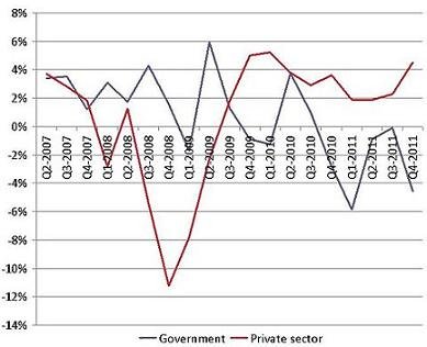
The New York Times’ David Leonhardt posted this rather remarkable chart the other day, pointing to two countervailing economic forces: the public sector and the private sector. In the image, the blue line shows government growth, while the red line reflects growth among businesses.
The chart paints quite a picture. As the severity of the Great Recession took its toll in 2008 and 2009, private-sector growth simply collapsed, though it’s clearly recovered since. But also note that blue line — as local, state, and federal officials have cut spending, public-sector growth has fallen.
The result is a problematic dynamic that’s entirely avoidable: we’re trying a stimulus and a counter-stimulus in response to the same economic conditions. As Leonhardt explained:
The private sector began to recover in 2009. The recovery slowed in 2010 and again in 2011, as the dips in the red line show. But by the end of last year, the private sector was expanding at a healthy 4.5 percent annualized pace.
Why, then, wasn’t economic growth in the most recent quarter better than the 2.8 percent that the Commerce Department reported today?
Because the economy is the combination of the private and public sectors. The public sector has been shrinking for the last year and a half — mostly because of cuts in state and local government, with some federal cuts, especially to the military, playing a role as well. In the fourth quarter, government shrank at an annual rate of 4.5 percent.
Recommended


Over the last two years, the private sector grew at an average annual rate of 3.2 percent, while the government shrank at an annual rate of 1.4 percent. The combined result has been economic growth of 2.3 percent.
If Americans wanted stronger economic growth, they needed to elect policymakers who’d pursue fewer spending cuts.
Indeed, the frustrating aspect to this is how preventable the problem is. The spending cuts that serve as a drag on the economy aren’t at all necessary — on the contrary, they’re easily avoided through federal action. It’s why nearly a third of the Recovery Act went to state aid to prevent public-sector cuts and layoffs. But as the stimulus came and went, so too did the benefit.
Federal officials could do this again — funds to prevent layoffs among teachers and first responders were part of the American Jobs Act — but congressional Republicans oppose such efforts, and have argued public-sector contraction is ultimately good for the economy, even if it leaves more workers unemployed and holds back growth.
With all of the economic problems policymakers can’t control, this is one problem Congress knows exactly how to prevent. It just chooses not to.
The place for in-depth analysis, commentary and informed perspectives.