


On Friday when Rachel showed that map of Boston with all the different immigrant populations in the different neighborhoods it reminded me of a series of maps I saw recently that show tweeted languages plotted on city maps.
Actually, as I understand it, the first one was a world map. They took geotagged tweets and ran them through a language identifier and then assigned the different languages different colors. The world map is ultimately mostly obvious. Lots of Japanese in Japan! Europe is a patchwork of languages (with lots of Italian tourists?)!
But then someone tried it with a map of London using a data set from the summer of 2012, when London was hosting the Olympics. You can make out ethnic neighborhoods and also appreciate the polyglot confetti.
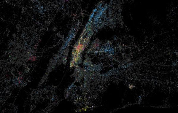
Naturally, as a New Yorker I have more appreciation for the more recent New York City version. Not only do we see the ethnic neighborhoods, but we see the madness of international tourism in Midtown, and if you scroll to the east you see that hodge podge mirrored in the travelers waiting at JFK International Airport. One point the developers make is that tweets do not necessarily represent population. I notice Chinatown doesn’t register enough to warrant a color, but Koreatown just east of Herald Square is distinct. That may be more a reflection of how technology is distributed than anything else. (Chinese registered 18th out of a total 38 detected languages tweeted in New York City in the first few months of 2013.)In case you’re curious, the documentation explains that the map is broken into points 50 meters apart, with tweet patterns analyzed within 100 meters of each point. That’s a pretty wide net, but fine enough to make out streets, neighborhoods and even stores. While you’re checking out JFK airport, head south to note the yellow Russian tweets of Brighton Beach. Or, maybe more remarkable, see the thin orange strip that intersects Grand Street downtown: Little Italy. Or, speaking of Italian tweets, see that orange blob at Broadway and 23rd Street? That’s Mario Batali’s massive Italian food market, Eataly, apparently massive enough to have its Italian visitors’ tweets register on the map.Friend of the Maddow show, Newark Mayor Cory Booker is usually on the show to talk about troubling issues like gun control, but his city’s other great claim to fame is outstanding Portuguese food. Zoom the map out a bit and look for Newark west of Manhattan to see why.Recommended

