


They say you are what you eat, but when it comes to alcoholic beverages you might also vote like you drink.
A recent study by National Media Research, Planning & Placement found that your drink preference may reveal a lot about your political affiliation, as well as how reliably you turn out to vote.
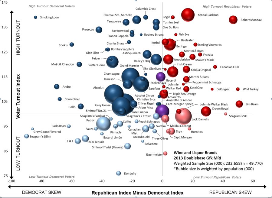
Using consumer research data, National Media charted over 50 major brands of wine and spirits according to voter registration and turnout history. The graph maps the political spectrum horizontally, from left to right, with blue and red colors denoting Democratic and Republican drink preferences, respectively. The vertical axis corresponds to turnout: selections appearing at the top of the chart are preferred by those who are most likely to vote, the bottom are least likely.
The findings show that Democrats are likely to prefer clearer spirits, like vodka or gin, while Republicans are tend to favor brown liquors, like bourbon or scotch. And while wine-drinkers crossover the partisan divide, they’re ranked as the most likely to vote according to turnout data. The most “bipartisan” alcohol turns out to be rum, with Captain Morgan’s Spiced Rum and Bacardi highlighted in purple in the middle of the spectrum.
Will Rabbe
Will Rabbe is a senior producer for "Inside with Jen Psaki." Recommended


![]()