


If you are a blue voter, you are surely aware of the criticism of red state/blue state maps that the balance is improperly displayed because many of the red states in the middle of the country have a lot of land but not very many voters, so giving those states a large area on a map is misleading.
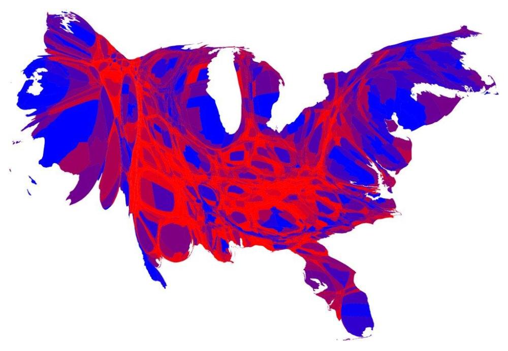
My favorite solution to this problem has always been the Spider-Man-looking county-by-county cartogram scaled to population or electoral vote size, like the one above by Mark Newman of the Department of Physics and Center for the Study of Complex Systems at the University of Michigan. The above shows “a color scale that ranges from red for 70% Republican or more, to blue for 70% Democrat or more.” Plus, it’s Spider-Man-like.
Meet me on the other side for not only the best map yet, but another one that’s a real mindblower.
This morning, io9 shared another solution to the problem: a Goldsberry map by John Nelson.

Nelson plotted a red or blue dot for every hundred votes for President Obama or Mitt Romney. You can see a bigger version here but I think it works best when you see the whole country and general patterns are visible (can you see the black belt?) along with a stark depiction of just how sparse the population is in those big red areas.
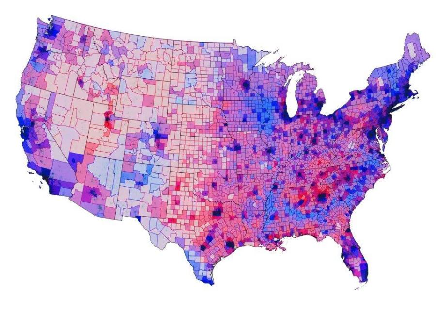
Unfortunately the details in the more heavily populated areas are lost in purple mud, so there’s not much to see if you look really close. Enter Chris Howard, a fantasy and science fiction author and illustrator who took the county-by-county map by Mark Newman and overlaid population density data from other sources to make the clearest picture I’ve seen of Purple America.* Now for the mindblower: Among the sources Howard cites in his explanation of his map is Princeton University’s Robert J. Vanderbei (Note to self, go back and play with his faculty page later). Vanderbei’s solution to showing the population differences without distorting the geography is to render the population data into a third dimension on a spinning 3D map. NOTE: The file is 55MB, so after you click, it takes a while to load. Here’s the direct link. *I’ve put a copy of the large version of the Chris Howard map on our media servers as well, to hopefully share some of the hosting burden, but please use the Chris Howard links as the credit is all his.Recommended

