


There has been a lot of talk about weather records lately. If you’ve been doing any fact-checking and finding yourself lost in a system of inscrutable pull-down menus and “animation” that doesn’t load, here are some shortcuts.
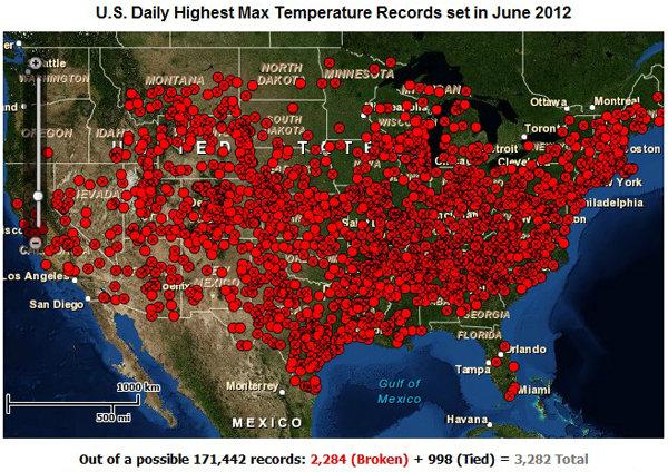
This is the map you’ve probably seen on blogs and Tumblr recently. It shows the number of daily highest temperature records set in the U.S. in June 2012.
The map was generated by this page on NOAA’s National Climatic Data Center site. (Climate Central has their own version that draws its data from the same place, but offers check-boxes for some other variables.)
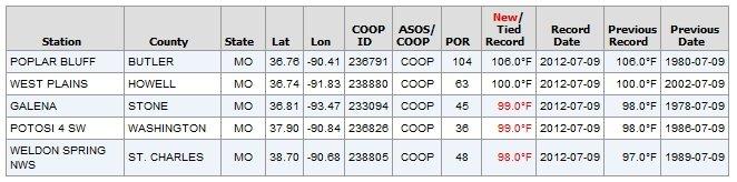
What I find more personally useful, if somewhat less dramatic, is searching that same tool by state and picking an individual day. What you get is a few of the state’s major cities plotted on a map, and a list of the record temperatures for those cities. Assuming you live relatively close to a city, this is where you go when you find yourself saying, “Damn, this has gotta be some kind of record!” Here’s Missouri on Monday.
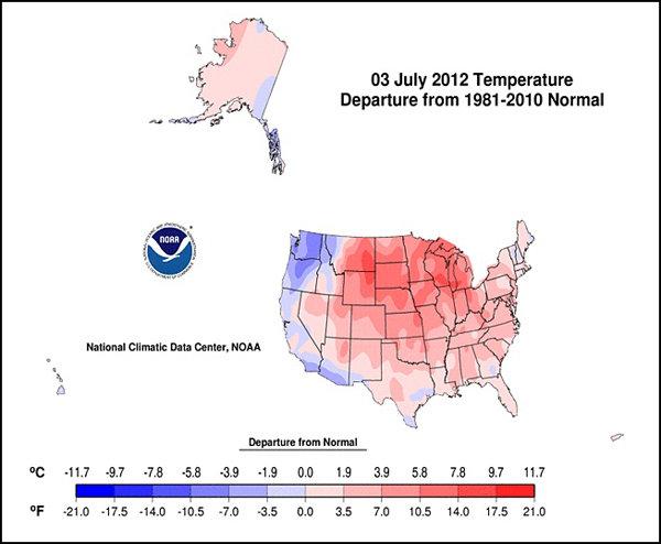
One more that’s fun are the U.S. ASOS Temp Departure & Degree Day Maps. Pick your date range and map and it plays a little time lapse of how those days differed from the 1981-2010 normal. Here’s a frame from the average temperature departure for the beginning of July.
Pick a nice long range and just watch the fronts pass through.
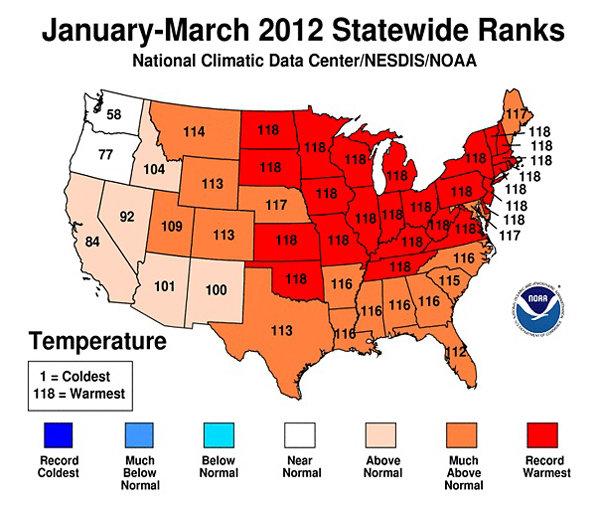
Every time I hear about temperature records I think about Guy Walton. Guy Walton co-authored a paper in 2009 describing how the U.S. is experiencing a significantly greater number of record highs than record lows. Now, every three months, Walton hosts a game he calls Climate Dice. We’re in the first third of the fifth rolling of the dice. The idea is that the National Climactic Data Center ranks temperature and precipitation on a scale from 1-118. (I haven’t gotten around to reading about how they got to 118, so if you know the story, please share.) You can generate those rankings for different time periods on their site here. So, for example, here’s a state level look at the rankings over the first three months of the year: In Climate Dice, you’re invited to guess what the national rank will be for each month in the season. If you think January will be warmer than usual, guess closer to 118. Submit your guesses in advance for each of the three months and it plays out kind of like the lottery. We’re already a third of the way into the summer quarter, so you’ll have to wait until fall to officially join in, but you can still play along at home. What’s clever about this game is that if you don’t believe in climate change, then you’ll want to keep your guesses around 59 because you expect normal weather. But if you do believe in climate change and you know the trends in record temperatures, you know you want to keep your guesses up in the 118 range. The spring numbers were “118/116/117 for MAR/APR/MAY 2012 with an overall Power Ball ranking for the season of 118.” Don’t think it’s a gimme though. Here’s Walton’s summer forecast (made in June): My forecast for this summer is for averages across the U.S. to continue to be warm but not as horrifically hot as they were the last couple of years. Also we are “due” to see at least one below average month during the summer. I won’t be shocked, at all though again, if just like last summer, fall, winter, and this spring not one single month of summer is below average. The last few posts I have been way under forecasting the observed warmth across the U.S. each season…I guess I’m just an eternal optimist. Recommended