


Remember a few weeks ago, when Fox News’ “Fox & Friends” aired a ridiculously misleading on-air graphic about President Obama’s jobs record? Today, they aired a sequel.
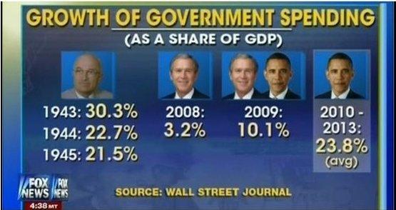
In this visual, viewers are told government spending has soared over the last three years. This point might be more interesting, if only it were accurate.
Like the Fox graphic from two weeks ago, the network’s graphics department got the politically-motived result they wanted by making another apples-to-oranges comparison. As Sahil Kapur explained:
In fact, the 2008 and 2009 figures reflect federal spending growth pegged to federal revenue, while the 2010-2013 figures counted spending growth as a share of the economy.
Recommended


A more direct comparison is unremarkable. If Fox applied the same standard as they used for Bush, then 2010-2013 spending growth under Obama would average 7.9 percent, down from 10.1 in 2009, the year that Bush and Obama shared.
Exactly. But “government spending has fallen over the last three years” isn’t the headline that advances Fox News’ preferred narrative — even though it’s accurate — so reality has to be manipulated into on-air graphics like these.
After the last incident, “Fox & Friends,” to its credit, aired a correction. Let’s hope they do the same in response to this nonsense tomorrow.
The place for in-depth analysis, commentary and informed perspectives.